GCSE Photography
Wednesday, 16 July 2014
Portraiture Final Piece 2
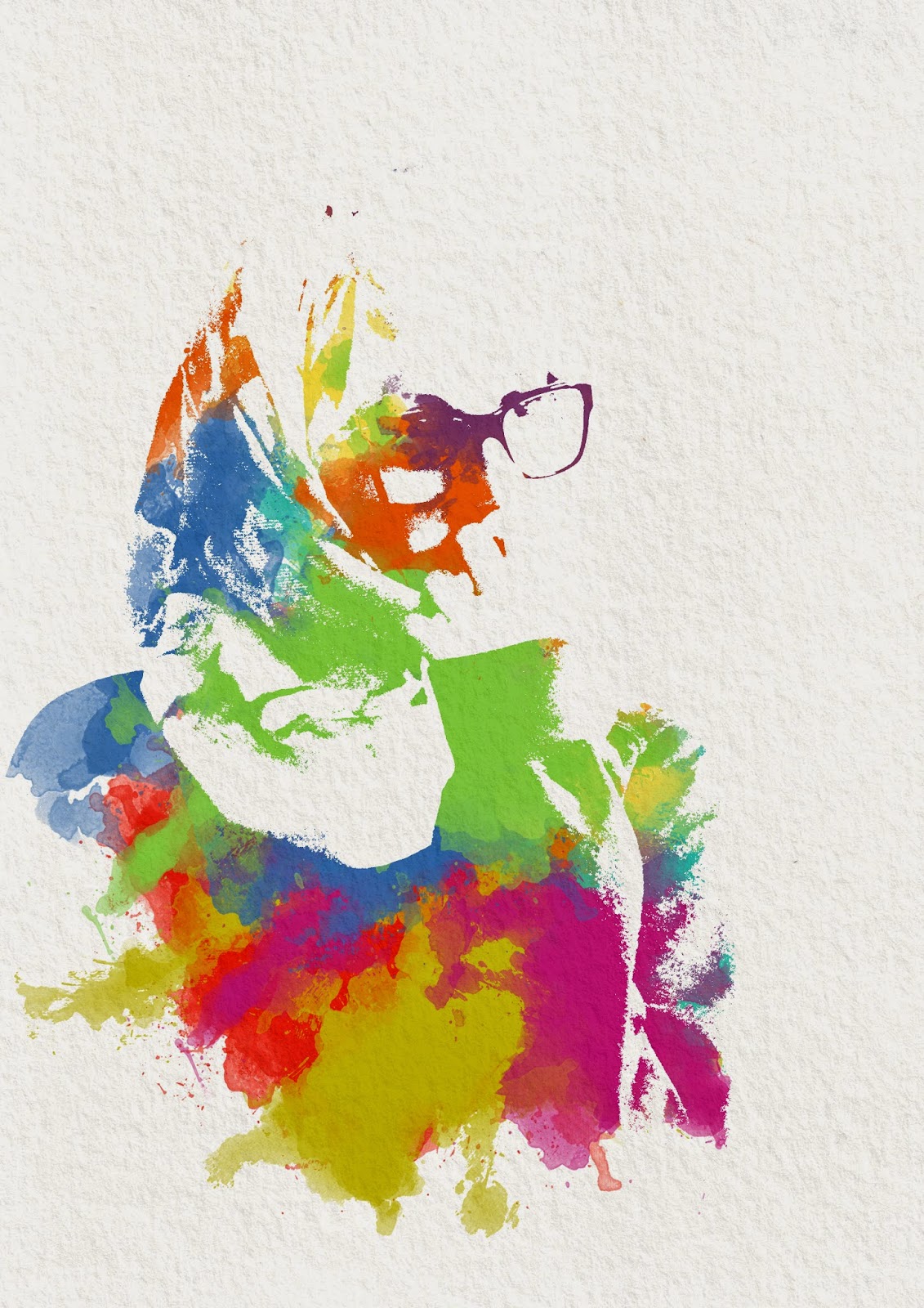
This is my second final piece from the Portraiture Project inspired by Russ Mills. This is very different from my first final piece as I wanted to try a new style. Originally, this image was going to be in the style of Stina Persson who I have researched before however the artist Russ Mills does similar work that I was inspired to try. For this image I used a portrait of Lina and made it completely black and white by increasing the threshold. I picked this image because I liked how she is looking off into the distance and also the detail in her face and hand. I then added a background and texture to make the image look older and more distressed. I then tried to recreate the brush strokes Mills uses on photoshop and using dark colours to match his style. However, I also included lighter colours around the face so the detail would not be lost and to make juxtaposition in the image. I love how the colours brighten the entire image up and how you have to look closely to find the subject.
Portraiture Final Piece 1
This is my first final piece for the Portraiture Project inspired by Dan Mountford's double exposure images. I used a portrait of Lina in front of a brick wall to add texture and layered another image over the top. This was of leaves on a branch which Lina and I decorated with daisies. This image I used was accidental as I did not mean to get the hand in shot however when I looked through the images, this one really appealed to me. I love how the arm goes around her head and looks as if it fits into place perfectly. To merge the layers I cycled through the blending mode options and chose 'Lighten' as it let the image show through the darkest parts. I also love the colours this made as it gives a faded 'vintage' feel which goes well with the portrait I think.
Monday, 9 June 2014
Arnold Newman research
This is an image by Arnold Newman who photographs people in their workplace. I like this more than an normal portrait because it gives you more information about the person and makes you want to know more. I also like how the background is cluttered because it adds to the affect of hectic work and makes you want to find clues to find more. I really like this idea and I will try to recreate this style in school.
Arnold Newman example
This is my image inspired by Arnold Newman who takes images of people at work. I tried to show Mr Black's job but also his personality through this image and I think it works quite well. He is standing in front of paintings (by another science teacher Mr. Wilkinson) of important science figures which shows what he does. I also like how he is interacting with this picture because this gives another interest point to the image.
Monday, 19 May 2014
Stina Persson example

These are my examples of an image inspired by Stina Persson. When taking the images I used a bright, harsh light which gave strong contrast on the face. I knew the shadows would be where the colour came through so I tried to position the model to get the most detail in the face. The image had to be desaturated and made into a pure black and white by increasing the threshold level. I then had to add a mask which allowed the colour to come through certain parts of the image. I then moved the watercolour splashes to get the most detail and the best final image. The colours used were very bright compared to Stina Perssons however I like how it gives a fun affect and really draws the viewers attention. My final piece will be based on this.
Stina Persson research
This image is by Stina Persson who edits her images in a way that makes them look like a watercolour painting. This is a very interesting concept that will be fun to recreate. I particularly like how you can see little detail in the face yet you can still recognise what it is. The flowers add extra delicate detail and I really like the finished look.
Friday, 9 May 2014
Maurizio Galimberti example
This is my example of a Maurizio Galimberti image. I did this by putting the model on a spinning chair so I could easily move it to get the right angles. After each 'layer' I moved the camera down on the tripod to get the end affect. I like how this turned out and it gives you an idea of how many different ways there is to look at things.
Subscribe to:
Posts (Atom)


