Friday, 28 February 2014
Barbara Kruger example
This is my own image inspired by Barbara Kruger. I love the meaning behind her style and edits and attempted to make one myself. I took the images in front of a black background which would give more contrast when i made it black and white. In photoshop, I desaturated the image to make it black and white and then added 'noise' in the adjustments folder to replicate the original affect on most of Barbara Kruger's work. The panel template has the slogan 'We are not what we seem' on it which made me chose the most sad/serious image from the photoshoot rather than the happy ones. To recreate the iconic inverted colours on Kruger's images I selected the middle panel and used the 'invert' tool which makes the image really stand out.
Barbara Kruger research
This is an image by Barbara Kruger who is famous for editing images in an unique way. She took images from magazines and inverted the colours on a section of the photograph. She also put different slogans over the top of them to get across her point of view about different slightly controvercial topics. I really like this image and the red/white colours for the words stand out very well and make you think about the statement. I think Kruger chose this image and slogan specifically to show that women are more complicated than they seem but also they are strong and powerful and shouldn't be underestimated. The woman in the image looks serious and smug almost which shows how women can be confident and should be taken seriously.
Monday, 24 February 2014
Thomas Couderc Clement Vauchez Stylized example
This is my example of a double exposure image that has been stylized in the style of Thomas Couderc Clement Vauchez. I did this by selecting the first layer then going on 'filter', 'stylize' and then 'find edges'. After that i had to inverse the filter so the background would be black not white. I did this by going to 'image', 'adjustments' and then 'invert'. I did this on both images seperately to achieve the affect when brought together at the end.
Thomas Couderc Clement Vauchez example
This is my own example of a Thomas Couderc Clement Vauchez style image. Instead of using a portrait and an animal to merge together in photoshop, I chose to use emotions portrayed through blue and red light. When i used the blue filter, I asked the model to look sad and upset and in contrast, I asked the model to look mad and angry in the red light. I changed the blending mode options on the top layer in photoshop to make the layers merge to create the final image.
Thomas Couderc and Clement Vauchez research
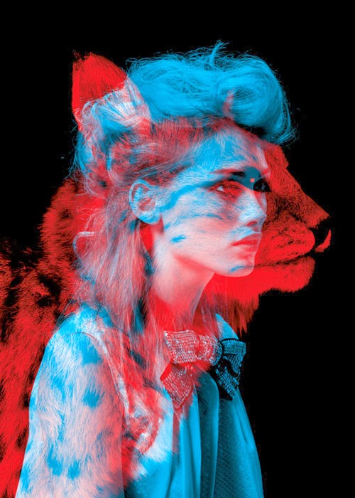
This is the most famous example of a Thomas Couderc and Clement Vauchez double exposure image. I like this image as it is very unusual compared to regualr double exposure images. The effect was achieved by using a black background and filters (red and blue) for the lights. This gives different coloured lights which makes a big contrast which is why this style is so recognisable.
Monday, 3 February 2014
Scott Jarvie example
This is my example of a Jarvie Window style image. I used a ring flash and a wide angled lens to achieve this affect. I asked Lina to put her hands in the foreground so they would become slightly distorted by the lens and so it gives the image a different perspective.
Scott Jarvie research
This is an image taken by Scott Jarvie using a wide angle lens and a flash ring. I like this style as it is really unique and gives an interesting point of view which sets his portraits apart from other traditional photographers. By putting the hands on the flash ring they seem much larger as they are closer to the wide angled lens which gives a peculiar affect. The dark background also gives an unusual perspective and I like how different it is. The 'window' of the flash is an impressive idea and I had fun when I attempted to recreate this style.
Subscribe to:
Comments (Atom)


