Wednesday 16 July 2014

Portraiture Final Piece 2


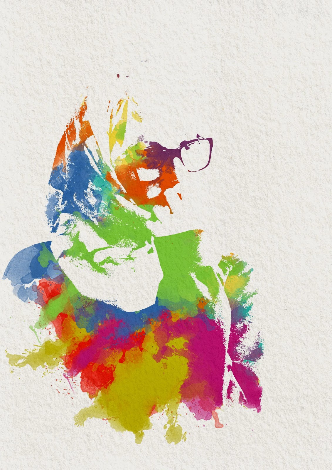
This is my second final piece from the Portraiture Project inspired by Russ Mills. This is very different from my first final piece as I wanted to try a new style. Originally, this image was going to be in the style of Stina Persson who I have researched before however the artist Russ Mills does similar work that I was inspired to try. For this image I used a portrait of Lina and made it completely black and white by increasing the threshold. I picked this image because I liked how she is looking off into the distance and also the detail in her face and hand. I then added a background and texture to make the image look older and more distressed. I then tried to recreate the brush strokes Mills uses on photoshop and using dark colours to match his style. However, I also included lighter colours around the face so the detail would not be lost and to make juxtaposition in the image. I love how the colours brighten the entire image up and how you have to look closely to find the subject. 

Portraiture Final Piece 1


This is my first final piece for the Portraiture Project inspired by Dan Mountford's double exposure images. I used a portrait of Lina in front of a brick wall to add texture and layered another image over the top. This was of leaves on a branch which Lina and I decorated with daisies. This image I used was accidental as I did not mean to get the hand in shot however when I looked through the images, this one really appealed to me. I love how the arm goes around her head and looks as if it fits into place perfectly. To merge the layers I cycled through the blending mode options and chose 'Lighten' as it let the image show through the darkest parts. I also love the colours this made as it gives a faded 'vintage' feel which goes well with the portrait I think. 

Monday 9 June 2014

Arnold Newman research


This is an image by Arnold Newman who photographs people in their workplace. I like this more than an normal portrait because it gives you more information about the person and makes you want to know more. I also like how the background is cluttered because it adds to the affect of hectic work and makes you want to find clues to find more. I really like this idea and I will try to recreate this style in school. 

Arnold Newman example


This is my image inspired by Arnold Newman who takes images of people at work. I tried to show Mr Black's job but also his personality through this image and I think it works quite well. He is standing in front of paintings (by another science teacher Mr. Wilkinson) of important science figures which shows what he does. I also like how he is interacting with this picture because this gives another interest point to the image.

Monday 19 May 2014

Stina Persson example


These are my examples of an image inspired by Stina Persson. When taking the images I used a bright, harsh light which gave strong contrast on the face. I knew the shadows would be where the colour came through so I tried to position the model to get the most detail in the face. The image had to be desaturated and made into a pure black and white by increasing the threshold level. I then had to add a mask which allowed the colour to come through certain parts of the image. I then  moved the watercolour splashes to get the most detail and the best final image. The colours used were very bright compared to Stina Perssons however I like how it gives a fun affect and really draws the viewers attention. My final piece will be based on this. 

Stina Persson research


This image is by Stina Persson who edits her images in a way that makes them look like a watercolour painting. This is a very interesting concept that will be fun to recreate. I particularly like how you can see little detail in the face yet you can still recognise what it is. The flowers add extra delicate detail and I really like the finished look. 

Friday 9 May 2014

Maurizio Galimberti example


This is my example of a Maurizio Galimberti image. I did this by putting the model on a spinning chair so I could easily move it to get the right angles. After each 'layer' I moved the camera down on the tripod to get the end affect. I like how this turned out and it gives you an idea of how many different ways there is to look at things. 

Maurizio Galimberti research


This image was made by rotating the model and the angle of the camera. The photographer, Maurizio Galimberti, worked in layers almost by lowering the camera after each row. I love the interest of the hands in the image and how it isn't completely symmetrical. If the image was 'perfect' it would be exactly the same on each side however I like it this way more as it is more intriguing. 

Julian Wolkenstein example


This image is inspired by Julian Wolkenstein's Symmetrical Portraits. I first duplicated the portrait so I had two, one in each frame. I then split the image in half, flipped it, and put put it on the opposite side of the face. I repeated this but with the other sie of the face to give two different portraits. This gave a completely symmetrial face which is normally very unusual however, in some cases, this project would not work and would give an almost identical photograph both times.  

Julian Wolkenstein research


This is an image by Julian Wolkenstein who uses the idea of reflection in their work. Most human faces are not completely symmetrical and this style of image can prove this. I like how you can get two completely different images from one portrait just by flipping half of it. I particularly like this image because of the tattoos. I think this makes the image more interesting as, in real life, they would not be so symmetrical and 'perfect'.  Another thing I like about this image is the light. The shadows vary on each image in an unusual way which makes the viewer do a double-take and really think about what has been changed. 

Friday 25 April 2014

Maxime Quoilin example


This is my image of Lina inspired by Maxime Quoilin. I really liked the editing process for this image as it was completely new. Both the portrait and the silhouette were desaturated in photoshop to give the black and white look which Maxime Quoilin uses a lot. I also had to increase the contrast on the silhouette to make sure it was clear. From my images I chose one where the facial expression was serious, almost sad - which works well for this type of image I think. I then used the blending mode 'screen' to back the black transparent and therefore it acted like a window through to the portrait below. I moved the image so the eyes lined up and also her scarf. I also cropped the image according to the rule of thirds by putting the eye in the upper left hand corner on the intercept which draws you to it. I also removed the logo from her jumper using the stamp tool on photoshop because I think it was distracting and detracted from the image. The final thing I added was the bokeh which is a style trait that Maxime Quoilin often uses. I am very happy with how this image turned out and I want to try more like this. 

Maxime Quoilin research


This is probably the most famous image by photographer Maxime Quoilin due to how different the perspective is. The style incorporates 2 images using the blending mode option on photoshop. The first image is a silhouette which is a side profile photograph and the second image is shot face-on. The way the images are put together lines some of the facial features up which gives a kind of optical-illusion which i especially like about this image. Another thing I like about this image is how muted the colours are which works well with the bokeh and gives an overall soft look.

Monday 24 March 2014

Matt Wisniewski example


This is my example of an image inspired by Matt Wisniewski. For this photoshoot the theme was fashion so the model did a range of typical poses. I also took a series of landscape photographs that I could merge with the portrait in photoshop. I imported the images and selected the clothes using the mask tool. I then inversed the mask so the clothes were selected and I could rub them out using the eraser tool at 10% opacity. This meant I could control how much of the portrait I was rubbing out and therefore how much the image underneath was coming through. After the double-exposure affect was finished I selected the background using the quick-select tool and painted it white using the brush tool. This gives the fashion magazine affect as there is no distracting details in the background. 

Matt Wisniewski research


This is my favourite image by Matt Wisniewki whose work is often in fashion and editorial magazines. I like this image in particular because I love the contrast in many ways. The thing that most stands out is the black and white portrait against the vibrant colours in the face. This gives an interesting perspective that I really like. The other contrast I noticed was how the pattern has sharp harsh lines but is in areas that are associated with being soft and kind like the hair and lips. It is as if the photographer is dehumanising the model and makes you focus on the clothes in the image which I think is very effective for a fashion magazine but is also an inspiring stand-alone image.

Friday 14 March 2014

Cris Wicks example using photoshop


This is my example of a Cris Wicks inspired image using photoshop for the words instead of drawing them by hand. I like my previous attempt much better as i found it hard to think of relevant words for this image. I will try to redo this to get a better affect. 

Monday 10 March 2014

Cris Wicks example


This is my finished image inspired by Cris Wicks. This was made using a printed out portrait of part of my face and layering tracing paper over the top. I then chose to use a theme of metaphors, most of which I found from songs and books. I wrote the words and phrases in black pen over the tracing paper, curving them to follow shapes like the eye and nose. I also tried to use relevant quotes like 'sleep and I remained strangers' under the eye where my lack of sleep shows and 'twin tears tracked tragic skin' on the cheek where tears would fall. The words layer was then scanned in and made into a virtual layer on photoshop where the words were selected and then cut from the black background. This acted like a window through the black layer to the portrait. I like the finished affect of this image and especially like the flow of the words around the face. 

quotes from
Eleanor & Park - Rainbow Rowell (book)
Extremely Loud and Incredibly Close - Jonathon Saffron Soer (book)
Looking For Alaska - John Green (book)
Paper Towns - John Green (book)
The Fault in Our Stars - John Green (book)
The A Team - Ed Sheeran (song)
Bullet - Hollywood Undead (song)
First Day of My Life - Bright Eyes (song)
Holding On - Alex Day (song)
Small Hands - Keaton Henson (song)
Wish For Is You - Alex Day (song)


Cris Wicks research


This is an photograph by Cris Wicks which is made up of words. This style is very unusual and very affective in my opinion. I like how defined the features of the face are and the different words and fonts shows different meanings throughout the image. I am going to make my own image based on this artist. 

Friday 28 February 2014

Barbara Kruger example


This is my own image inspired by Barbara Kruger. I love the meaning behind her style and edits and attempted to make one myself. I took the images in front of a black background which would give more contrast when i made it black and white. In photoshop, I desaturated the image to make it black and white and then added 'noise' in the adjustments folder to replicate the original affect on most of Barbara Kruger's work. The panel template has the slogan 'We are not what we seem' on it which made me chose the most sad/serious image from the photoshoot rather than the happy ones. To recreate the iconic inverted colours on Kruger's images I selected the middle panel and used the 'invert' tool which makes the image really stand out. 

Barbara Kruger research


This is an image by Barbara Kruger who is famous for editing images in an unique way. She took images from magazines and inverted the colours on a section of the photograph. She also put different slogans over the top of them to get across her point of view about different slightly controvercial topics. I really like this image and the red/white colours for the words stand out very well and make you think about the statement. I think Kruger chose this image and slogan specifically to show that women are more complicated than they seem but also they are strong and powerful and shouldn't be underestimated. The woman in the image looks serious and smug almost which shows how women can be confident and should be taken seriously. 

Monday 24 February 2014

Thomas Couderc Clement Vauchez Stylized example


This is my example of a double exposure image that has been stylized in the style of Thomas Couderc Clement Vauchez. I did this by selecting the first layer then going on 'filter', 'stylize' and then 'find edges'. After that i had to inverse the filter so the background would be black not white. I did this by going to 'image', 'adjustments' and then 'invert'. I did this on both images seperately to achieve the affect when brought together at the end.

Thomas Couderc Clement Vauchez example


This is my own example of a Thomas Couderc 
Clement Vauchez style image. Instead of using a portrait and an animal to merge together in photoshop, I chose to use emotions portrayed through blue and red light. When i used the blue filter, I asked the model to look sad and upset and in contrast, I asked the model to look mad and angry in the red light. I changed the blending mode options on the top layer in photoshop to make the layers merge to create the final image.

Thomas Couderc and Clement Vauchez research


This is the most famous example of a Thomas Couderc and Clement Vauchez double exposure image. I like this image as it is very unusual compared to regualr double exposure images. The effect was achieved by using a black background and filters (red and blue) for the lights. This gives different coloured lights which makes a big contrast which is why this style is so recognisable.

Monday 3 February 2014

Scott Jarvie example


This is my example of a Jarvie Window style image. I used a ring flash and a wide angled lens to achieve this affect. I asked Lina to put her hands in the foreground so they would become slightly distorted by the lens and so it gives the image a different perspective.

Scott Jarvie research


This is an image taken by Scott Jarvie using a wide angle lens and a flash ring. I like this style as it is really unique and gives an interesting point of view which sets his portraits apart from other traditional photographers. By putting the hands on the flash ring they seem much larger as they are closer to the wide angled lens which gives a peculiar affect.  The dark background also gives an unusual perspective and I like how different it is. The 'window' of the flash is an impressive idea and I had fun when I attempted to recreate this style.

Friday 24 January 2014

Simoes Grid research


This is a portrait by Lucas Simoes which is made of multiple pictures combined on photoshop. It is a very unique style and was fun to try and recreate. We used texture templates on top of three different portraits (each portraying a different emotion) and eventually, combined all of the layers to make the desired affect.

Dan Mountford example


This is my example of a Dan Mountford style image. I took various shots including portrait and landscapes in order to combine them both in one image. In photoshop, i imported the images and positioned the portrait on the top layer. I then lowered the opacity of the rubber to rub away at the image at the places i wanted the tree to show the most. I mostly left the eyes so the tree behind them would not be distracting. I like the final affect and want to try different ways of getting this style of image like changing the blending options.

Monday 20 January 2014

Friday 10 January 2014

Environment Project


This is my Environment Project final piece. I interpreted the theme of environment by taking images of the things around me. I focused the images around light and particularly natural light which makes the images seem more raw and unique. I used multiple exposure and also long exposure to achieve each image and to have the lights as vibrant as possible. I also mainly took my images at the sunset magic hour and later to achieve a dark, night-time set of images. I compiled my favourite images from the various shoots into a collage on photoshop. I set the spacing to show the different images clearly but they are not to prominant that it breaks up the overall photograph.